


SOGO is an ice cream brand created to rethink how taste is perceived. In a world where desserts are often expected to be cute, sweet, and predictable, SOGO explores ice cream as a sensory experience — one that can feel calm, intense, and emotionally charged.
The brand is built around contrast. Cold meets heat. Softness meets tension. What looks familiar reveals something unexpected.
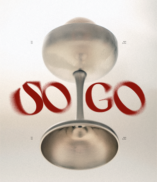
At the heart of SOGO lies the idea of two states — SO and GO.
Not as labels, but as moments we move through: slowing down, or moving forward.
The brand is built around contrast. Cold meets heat. Softness meets tension. What looks familiar reveals something unexpected.
At the heart of SOGO lies the idea of two states — SO and GO.
Not as labels, but as moments we move through: slowing down, or moving forward.
PROJECT DESCRIPTION
SOLUTION
Ice cream is usually associated with cold, comfort, and safety.
SOGO deliberately challenges this perception.
The identity is built on the transition between two states: SO and GO. One is a moment to slow down. The other is a moment to move forward. The logo is designed as if shaped from snow. Fragile and unstable, it emphasizes the fleeting nature of taste. It exists only in the present moment, just like flavor itself.
Through expressive typography and a striking photographic style, the identity creates tension between opposites: cold and heat, softness and intensity, pause and movement. SOGO does not dictate how ice cream should be experienced. It leaves space for a personal rhythm, for choosing when to slow down and when to go. Taste matters — because it is never just about flavor.
SOGO deliberately challenges this perception.
The identity is built on the transition between two states: SO and GO. One is a moment to slow down. The other is a moment to move forward. The logo is designed as if shaped from snow. Fragile and unstable, it emphasizes the fleeting nature of taste. It exists only in the present moment, just like flavor itself.
Through expressive typography and a striking photographic style, the identity creates tension between opposites: cold and heat, softness and intensity, pause and movement. SOGO does not dictate how ice cream should be experienced. It leaves space for a personal rhythm, for choosing when to slow down and when to go. Taste matters — because it is never just about flavor.







Contacts
veilisdesign@gmail.com


